← All Work
King of Clippers
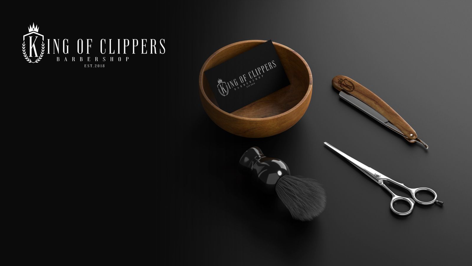
A barbershop trading since 2018 with a reputation already built. The job was not to announce anything — it was to give an established shop a mark that matched the standard of the cut. Most barbershop branding shouts. This one needed to do the opposite and still be the most memorable thing on the street.
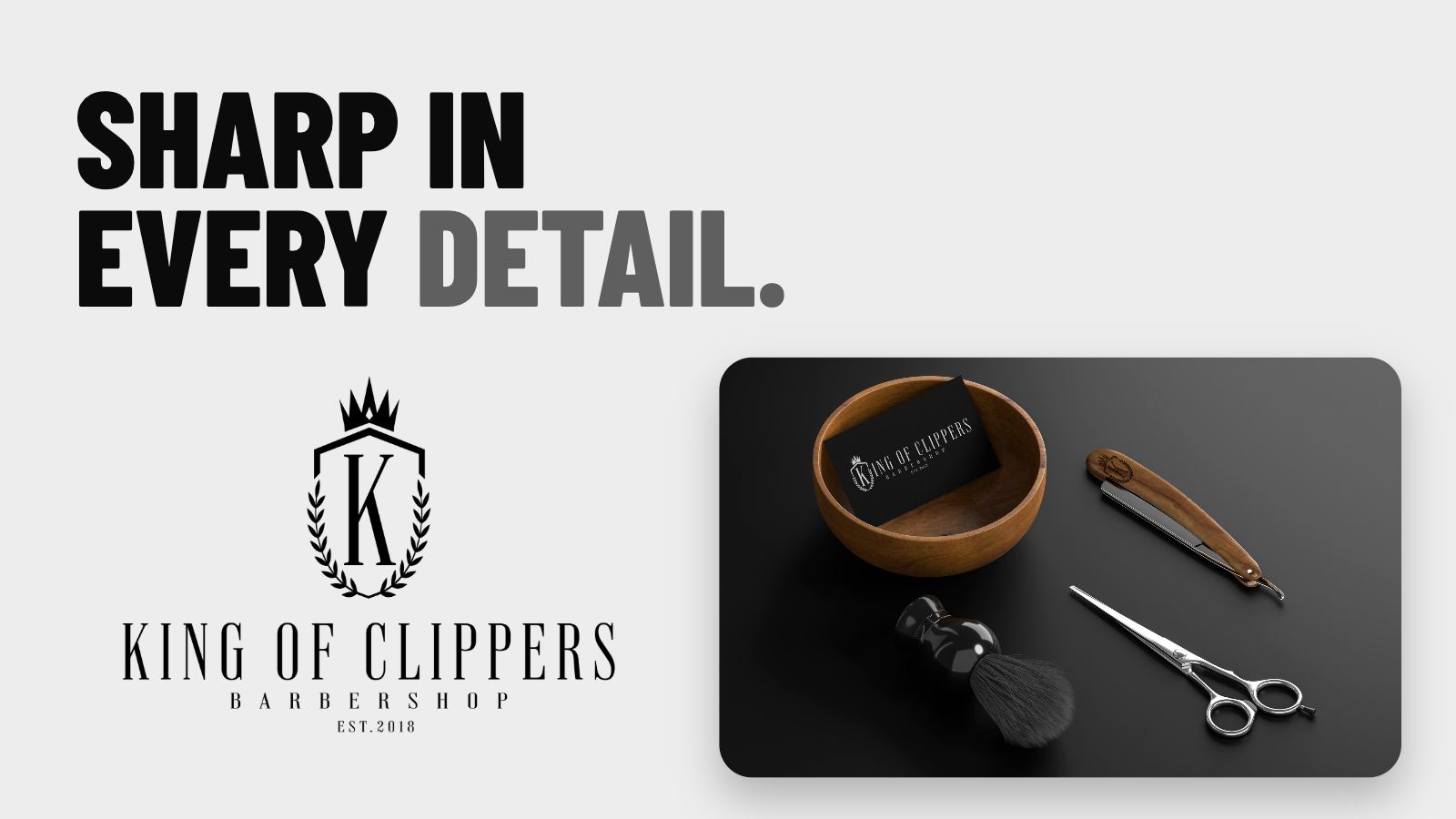
A crest built around a single letterform — the K held inside a shield, crowned above and wreathed in laurel, with a fine serif wordmark beneath. Monochrome only. No second colour, no gradient, nothing that needs explaining. The restraint is the point: a mark this quiet has to be drawn precisely, because there is nothing to hide behind.
The mark was drawn to survive reduction. The full crest carries a shopfront; the wordmark alone carries a business card; the K and crown alone brand a razor handle. Each is a deliberate version rather than the same artwork scaled down until the laurel turns to mud — which is where most detailed crests fail.
Designed to be remembered.
Campaign line — King of Clippers
A barbershop that now looks as considered as its work. The identity reads premium without claiming it, and holds from a razor engraving through to the shopfront without a single redraw.
Tell us about your business and what you're trying to achieve. We'll tell you exactly what it's going to take.