← All Work
Webster's Family Plumbing
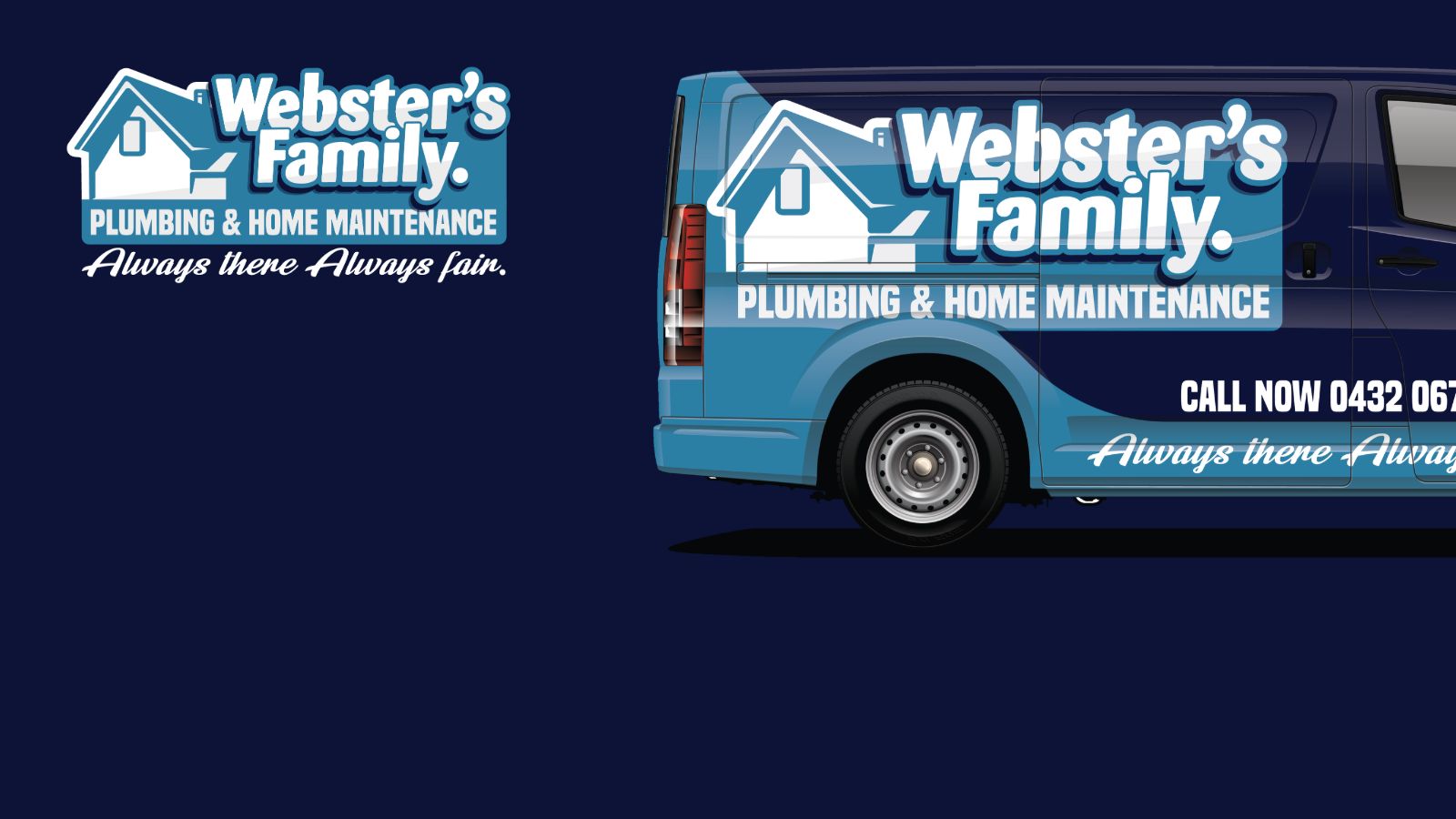
A family plumbing and home maintenance business building out properly for the first time. Rather than commissioning a logo and working outward from it piece by piece, the whole system was specified up front.
Logo suite built around a house mark, in a two-tone blue palette with a handwritten support line. The identity was designed simultaneously for vehicle livery, building signage and print collateral — so nothing needed reworking when it moved between surfaces.
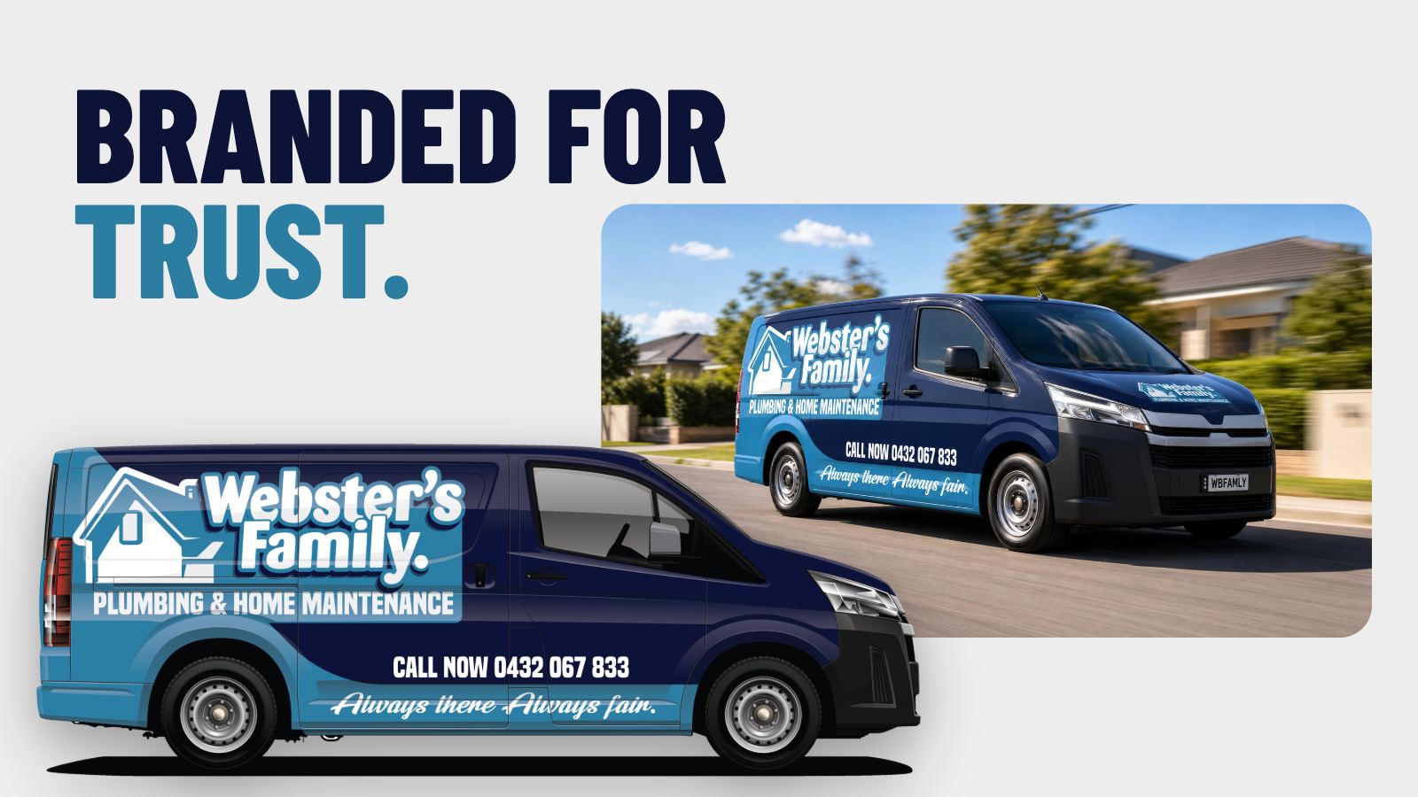
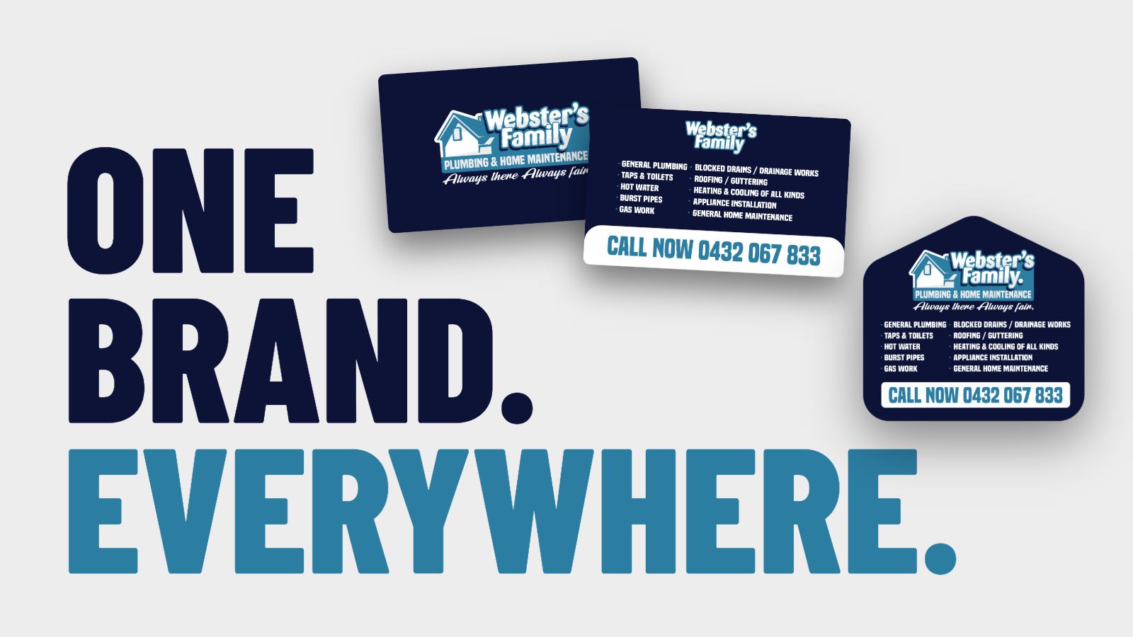
Most trade brands are assembled piece by piece — a logo, then a van, then cards, each one reacting to the last. Webster's was specified whole. The identity was drawn knowing it had to hold on a van panel, a business card and a fridge magnet, so nothing needed reworking when it moved between surfaces.
Always there. Always fair.
Brand line — Webster's Family Plumbing
Van, building signage and collateral all launched together carrying one identity. The business looked established from its first day on the road.
Tell us about your business and what you're trying to achieve. We'll tell you exactly what it's going to take.