← All Work
True Horizon Care Group

An NDIS provider supporting people with disability and their families across Melbourne. Care branding tends to fall into one of two traps — clinical and cold, or soft to the point of saying nothing. True Horizon needed to read as calm, capable and honest to a participant and their family making a decision that matters.
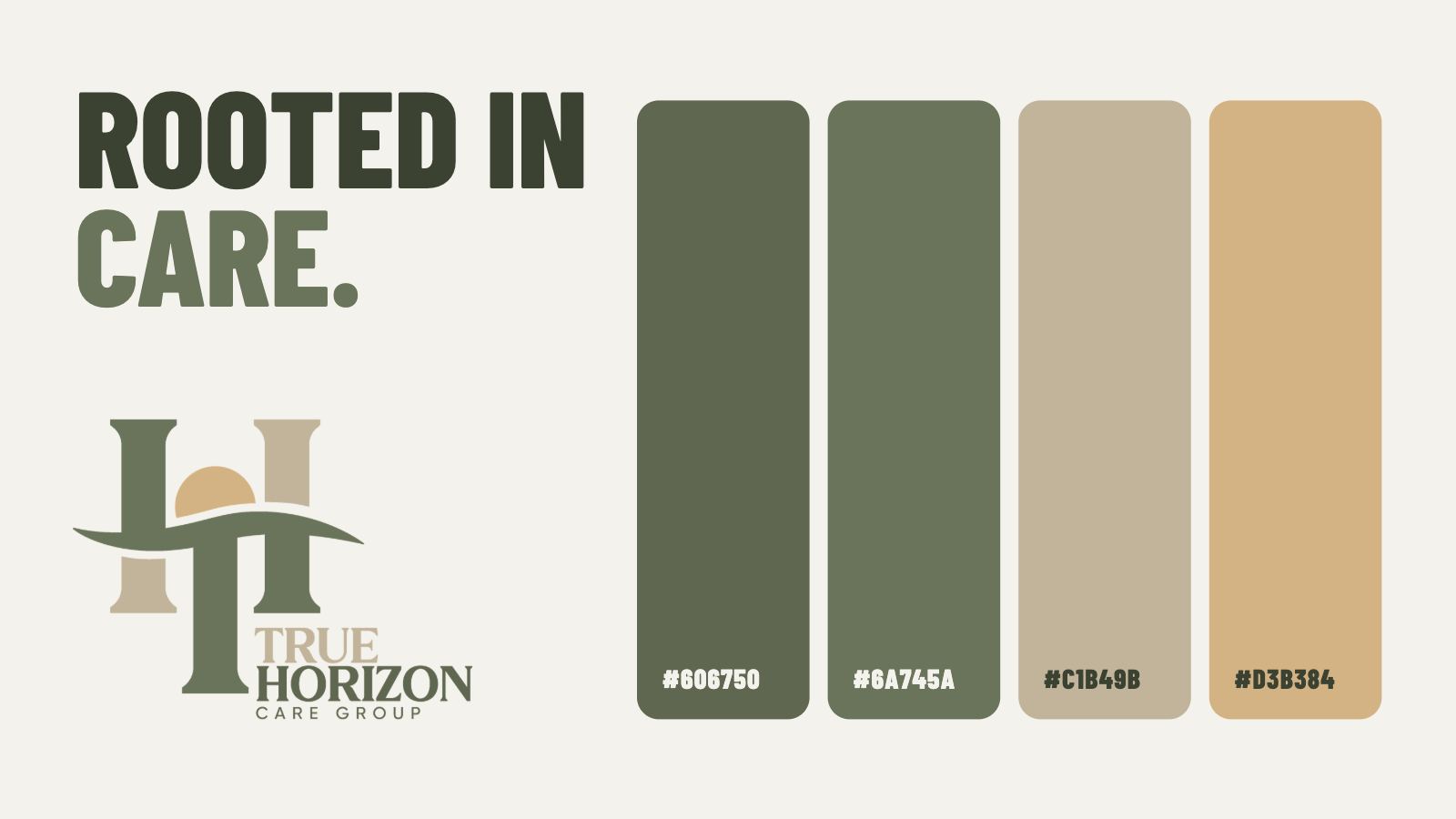
A complete identity built from the ground up. The mark sets two pillars against a rising sun on a horizon line — stability and a way forward, which is what the business actually sells. A muted palette of deep green, sage, stone and warm sand holds the tone without resorting to the pastel blue every care provider defaults to. The system then carried straight into a full website design.
The palette was specified before any layout work. Four colours, each with a job: deep green for authority, sage for warmth, stone for structure, sand for the sun. Every surface from the logo through to the website draws only from these, which is what keeps the brand feeling settled rather than assembled.
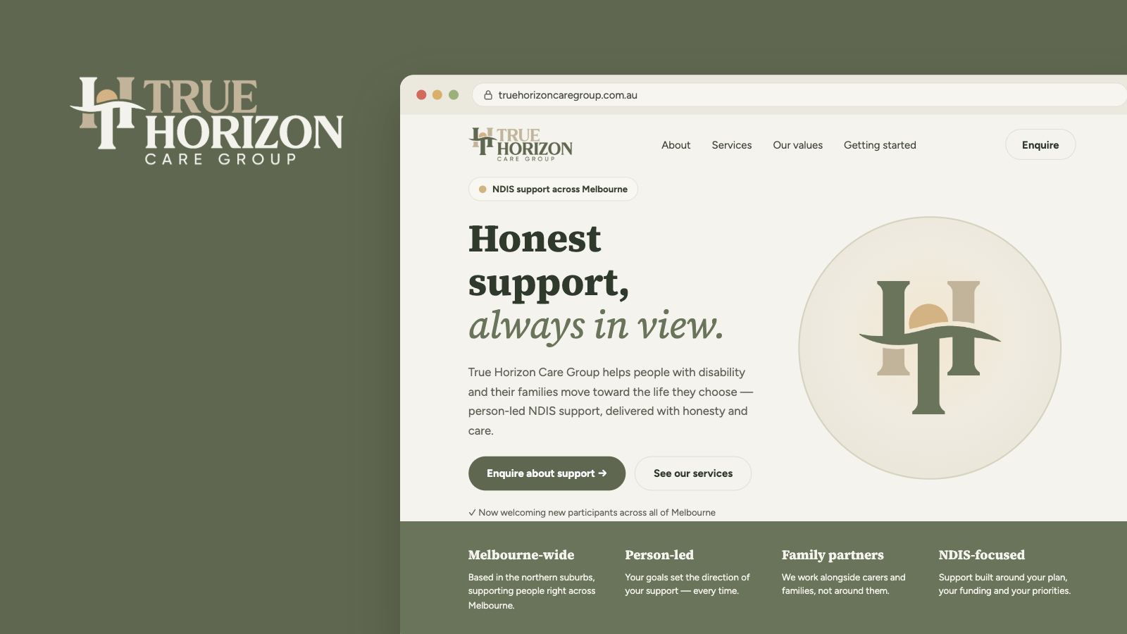
Honest support, always in view.
Brand line — True Horizon Care Group
A care brand that looks like it has been running for years rather than launching. The identity, palette and website all landed together, so the business presents one consistent face from the first search result through to the enquiry.
Tell us about your business and what you're trying to achieve. We'll tell you exactly what it's going to take.